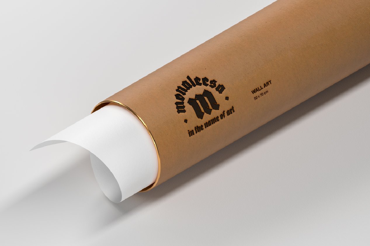
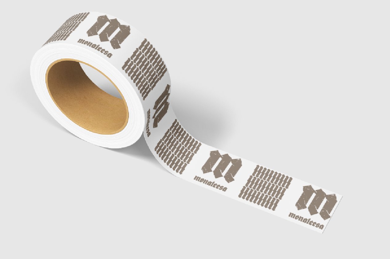
Brand Identity for an Art Gallery.
The project required visuals that communicate the essence of Mona’s art: Lithography.
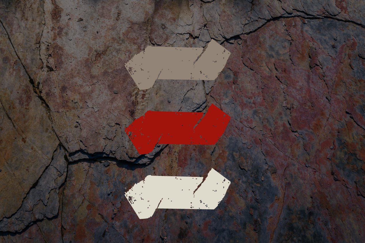
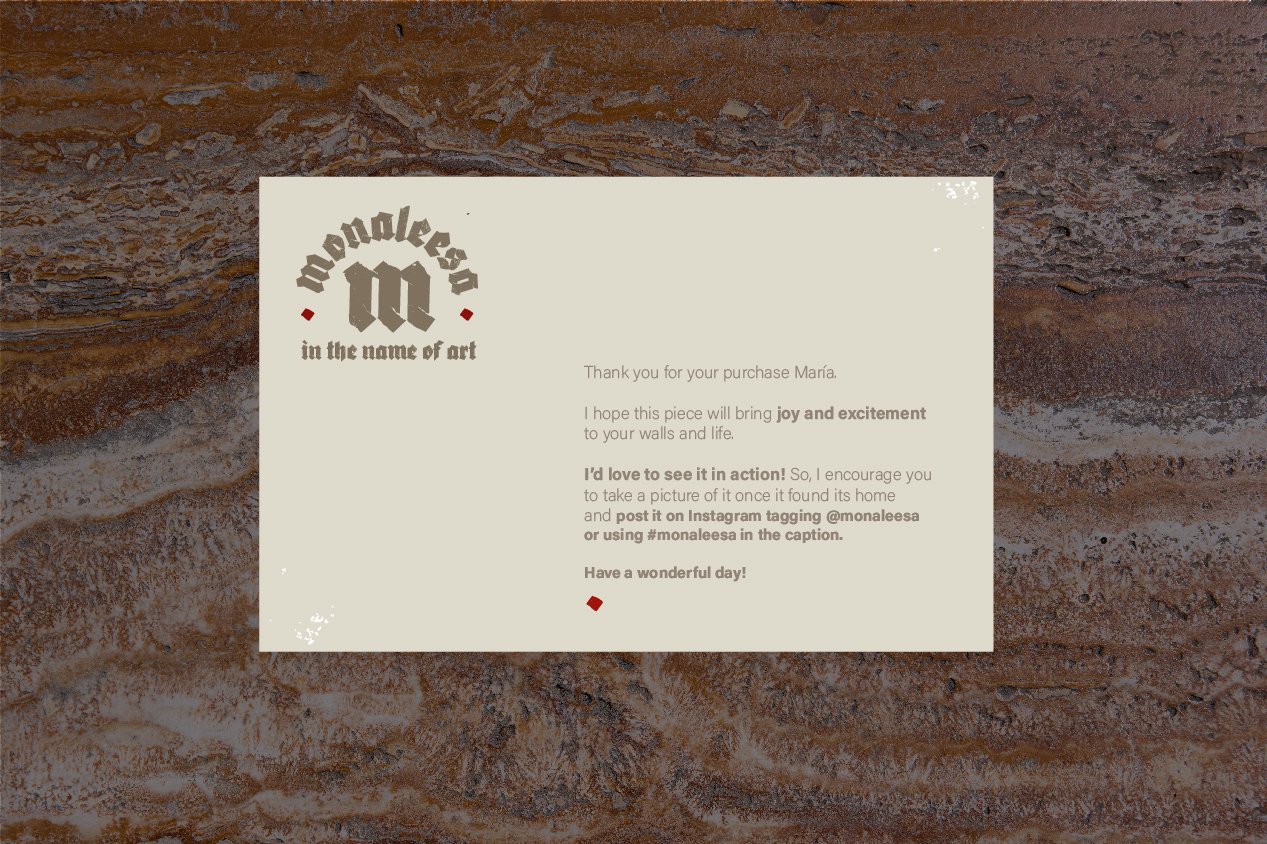
Lithography was originally made with stone plates and had a very rough result. That’s why I chose the stone texture for the logo and for the photography.
MonaLeesa is part of the #briefbabes project.

