

Quirky // Personal // Use of a Character // Bright + Pastel Colors // Fun
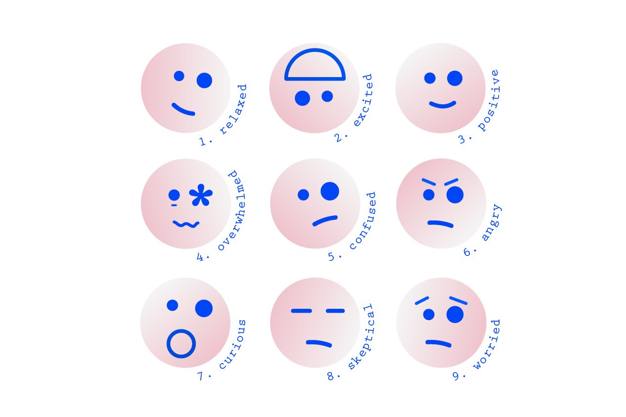
HSP Vibes is a community for Highly Sensitive People. The mission was to create a branding that could represent the wide range of emotions that HPS people go through.
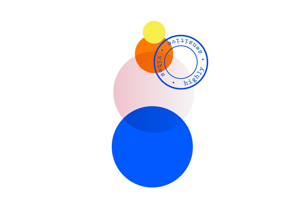
The colors should be bright and fun, with the addition of pastel colors to represent the calmness they seek for.
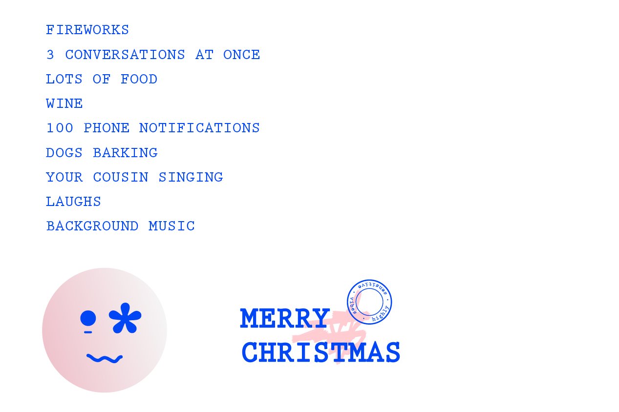
The result was a super fun and catchy branding that was flexible while keeping the identity recognizable.

